In today’s fast-paced digital world, where attention spans are shorter than ever, conveying complex information quickly and effectively is paramount. Enter infographics—a powerful tool that combines visual design, concise text, and data visualization to present information in an easily digestible format. But what exactly are they, and why have they become such a staple in content marketing, education, and even news reporting?
Infographics are essentially visual representations of data or information, designed to make complex topics simple. Think of them as a bridge between raw data and a compelling story. They have the unique ability to transform dense and dry information into engaging, informative, and visually appealing content. Whether it’s a colorful chart illustrating the latest trends in social media or a flowchart explaining a scientific process, infographics have a way of capturing our attention and making learning enjoyable.

History of Infographics
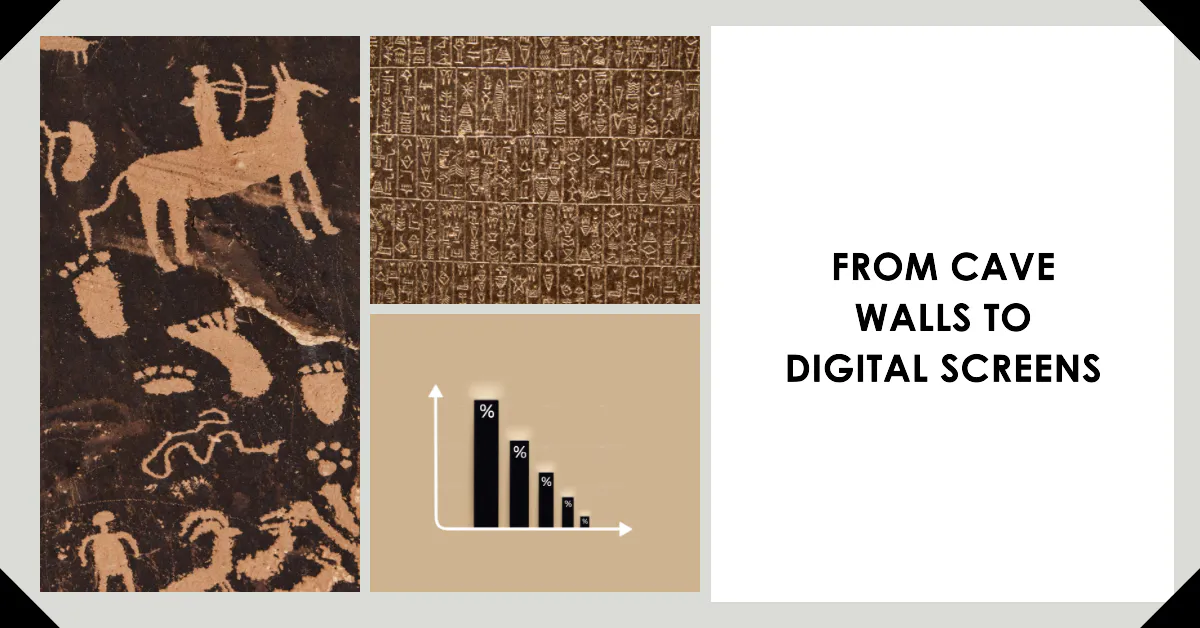
The art of visually representing information isn’t a new concept. Long before the term “infographic” became a buzzword in the digital age, humans have been using visuals to convey information, tell stories, and record history.
Ancient Beginnings
- Hieroglyphics: One of the earliest forms of visual storytelling can be traced back to ancient Egypt with hieroglyphics. These pictorial scripts were more than just art; they were a form of writing that conveyed religious texts, royal decrees, and historical events on temple walls and papyrus scrolls.
- Cave Paintings: Even before written language, prehistoric humans used cave paintings to depict daily life, hunting scenes, and celestial events. Sites like the Lascaux caves in France showcase intricate drawings that served as early infographics, telling stories without words.
Middle Ages and Renaissance
- Medieval Maps: During the Middle Ages, cartographers began creating detailed maps, not just for navigation but also to depict territories, trade routes, and even mythical creatures. These maps were early infographics, blending art with data.
- Leonardo da Vinci’s Sketches: The Renaissance polymath, Leonardo da Vinci, was known for his detailed anatomical sketches. His drawings of the human body, machines, and nature were meticulous visual representations of his observations and studies.
Modern Era

- Florence Nightingale’s Rose Diagram: In the 19th century, Florence Nightingale, the founder of modern nursing, used a “rose diagram” to visualize the causes of mortality during the Crimean War. Her infographic was instrumental in improving hospital conditions.
- 20th Century and the Rise of Data Visualization: As technology advanced, so did the methods of visualizing data. The 20th century saw a surge in the use of graphs, pie charts, and bar diagrams in academia, business, and media.
Digital Revolution
- Infographics Go Digital: With the advent of the internet and design software in the late 20th and early 21st centuries, infographics transitioned from paper to screens. They became a popular tool for bloggers, marketers, and news outlets to present data in an engaging manner.
- Interactive and Animated Infographics: Today, infographics have evolved beyond static images. With the rise of web technologies, we now have interactive infographics that allow users to explore data at their own pace and animated infographics that add a dynamic touch to data presentation.
Infographics have been a testament to humanity’s enduring quest to communicate complex ideas through visuals. As we continue to innovate and evolve, one thing remains clear: the power of visual storytelling is timeless.
Why Infographics are Essential in Digital Marketing
Standing out online is no easy feat. Every day, millions of articles, videos, and social media posts are vying for the attention of users. Amidst this digital noise, infographics emerge as a beacon of clarity, offering a refreshing way to consume information. But what makes them so indispensable in the world of digital marketing?
The Science Behind Visual Learning
- A Picture is Worth a Thousand Words: It’s not just a saying; it’s rooted in how our brains work. Visuals are processed 60,000 times faster than text. When we see an image, our brains decode it almost instantly, making infographics a rapid means of information transfer.
- Retention and Recall: Studies have shown that people remember 80% of what they see compared to just 20% of what they read. Infographics, with their blend of visuals and minimal text, are more likely to be remembered by viewers.
Benefits of Using Infographics in Content Marketing
- Increased Engagement: Infographics are share-worthy. They’re more likely to be shared on social media platforms, leading to increased engagement and reach.
- Boost in Traffic: Websites that use infographics grow traffic an average of 12% more than those that don’t. They’re clickable, shareable, and can easily go viral, driving a surge of visitors to your site.
- Complex Ideas Simplified: Some topics are just hard to explain with words alone. Infographics break down complex ideas into digestible chunks, making them accessible to a wider audience.
- Brand Awareness and Authority: A well-researched and beautifully designed infographic can position your brand as an authority in your niche. It showcases your expertise and commitment to providing value to your audience.
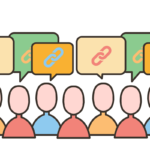
- SEO Benefits: Infographics can earn backlinks. When other websites share or embed your infographic, it can boost your site’s authority and improve its ranking on search engines.
Infographics have solidified their place as a versatile and effective tool. They cater to our visual nature, simplify complexity, and have the power to make your content go viral.
Types of Infographics
Infographics come in various shapes and sizes, each tailored to present information in the most effective way possible. Depending on the data and the story you want to tell, you can choose from a range of infographic styles.
Statistical Infographics
If you have a lot of data and statistics to share, this is your go-to format. Statistical infographics use charts, graphs, and numbers to visualize and compare data, making it easier for readers to grasp complex statistics at a glance.

Informational Infographics
These are probably what most people think of when they hear the term “infographic.” They provide a quick overview of a topic, breaking down complex information or processes into easily digestible sections, often accompanied by engaging visuals.

Timeline Infographics
History, processes, or any topic that has a chronological element can benefit from a timeline infographic. They visually represent events or steps in a sequence, making it easy for readers to follow along and understand the progression.

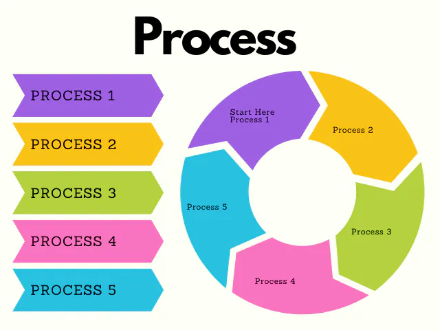
Process Infographics
Process infographics break down and illustrate a process step-by-step, guiding the reader from start to finish.
Geographic Infographics
These infographics use maps as their primary visual. They’re perfect for showcasing location-based data, comparing data across different regions, or simply providing a geographical context to information.

Comparison Infographics
Can’t decide between two things? Comparison infographics lay out the pros and cons side by side, helping readers make informed decisions. They’re great for product comparisons, contrasting concepts, or any topic where a side-by-side analysis is beneficial.

Hierarchical Infographics
When you need to showcase information in a hierarchical order or display data that has multiple levels, these infographics come in handy. They often use pyramid or flowchart structures to represent data.

Each type of infographic serves a unique purpose and is best suited for specific kinds of data and information. The key is to choose the one that aligns best with your content and resonates with your audience.
Steps to Create a Compelling Infographic
Creating an infographic isn’t just about slapping together some visuals and data. It’s an art and science that requires a thoughtful approach.

1. Choosing the Right Data
- Research Thoroughly: Start with credible sources. Whether it’s a government database, a reputed research institution, or a well-known industry report, ensure your data is accurate and up-to-date.
- Keep it Relevant: Your data should align with your topic and resonate with your target audience. Avoid overwhelming your readers with too much information. Less is often more.
2. Define Your Objective
- Know Your Purpose: Are you trying to explain a complex process, showcase a comparison, or present survey results? Your objective will dictate the type of infographic you choose.
- Target Audience: Tailor your infographic to your audience’s preferences, knowledge level, and needs.
3. Design Principles and Color Theory
- Consistency is Key: Use a consistent color scheme, font style, and design elements throughout your infographic.
- Color Psychology: Colors evoke emotions. Choose colors that align with your message. For instance, blue can convey trust, while red can signify urgency.
4. Layout and Flow
- Logical Progression: Ensure your information flows logically. Use arrows, lines, or numbered steps to guide the reader.
- Whitespace: Don’t clutter. Whitespace can help in making your infographic more readable and visually appealing.
5. Add a CTA (Call to Action)
- Engage Your Readers: Whether it’s directing them to your website, encouraging them to share the infographic, or prompting them to read a related article, a clear CTA can boost engagement.
6. Proofread and Review
- Accuracy Check: Ensure all data, facts, and figures are correct.
- Design Review: Check for any design inconsistencies or errors. It’s always a good idea to get a second pair of eyes to review your work.
7. Publish and Promote
- Share Widely: Use your social media platforms, embed it in blog posts, or even consider paid promotions to reach a wider audience.
- Optimize for SEO: Remember to use alt text and relevant LSI keywords when uploading your infographic to your website.
Creating a compelling infographic is a blend of creativity, research, and design skills. But with the right approach and tools, you can craft visuals that captivate and inform your audience.
Tools and Software Recommendations for Infographic Creation
In the world of infographic design, having the right tools at your disposal can make all the difference. Whether you’re a beginner looking for a user-friendly platform or a seasoned designer in search of advanced features, there’s a tool out there tailored to your needs. Here’s a breakdown of some of the most popular and effective tools for infographic creation:
Beginner-Friendly Platforms
- Canva: A web-based design tool that offers a plethora of templates for infographics. Its drag-and-drop interface makes it incredibly user-friendly, even for those with no design experience. Canva also provides a vast library of icons, images, and fonts to spruce up your design.
- Piktochart: Another web-based tool, Piktochart specializes in infographics, presentations, and printables. With a variety of templates and a user-friendly interface, it’s a favorite among many content creators.
- Venngage: This platform offers a wide range of design templates, including infographics, reports, and social media posts. Its intuitive interface allows for easy customization, making it a go-to for many marketers and bloggers.
Advanced Design Software
- Adobe Illustrator: A vector graphics editor, Adobe Illustrator is a powerhouse in the design world. Its advanced features allow for intricate designs and high-quality infographics. While it has a steeper learning curve, the results can be truly professional.
- CorelDRAW: Another vector graphics editor, CorelDRAW offers a suite of tools for graphic design. Its features are tailored for intricate illustrations, making it a solid choice for detailed infographics.
- Inkscape: A free, open-source vector graphics editor, Inkscape offers many of the capabilities of its paid counterparts. It’s a great option for those on a budget but still looking for advanced design features.
Interactive and Animated Infographics
- Visme: Beyond static infographics, Visme allows users to create interactive and animated visuals. With a range of templates and the ability to embed videos, maps, and other interactive elements, it’s perfect for those looking to take their infographics to the next level.
- Infogram: This platform specializes in data visualization. It’s perfect for creating interactive charts, graphs, and infographics that can be embedded on websites or shared on social media.
Choosing the right tool depends on your design needs, level of expertise, and budget. Whether you’re crafting a simple infographic for a blog post or a detailed visual report for a corporate presentation, these tools and software can help bring your vision to life.

Promoting Your Infographic
Creating a stunning infographic is only half the battle. To ensure it reaches the widest audience and achieves its intended impact, effective promotion is key.

1. Share on Social Media Platforms
- Visual Platforms Shine: Platforms like Pinterest and Instagram, which emphasize visual content, are perfect for sharing infographics. A well-designed infographic can quickly gain traction and go viral on these platforms.
- Twitter & Facebook: While they’re not solely visual platforms, both Twitter and Facebook have massive user bases. Sharing your infographic with an engaging caption can boost its visibility.
- LinkedIn: If your infographic is business or industry-related, LinkedIn can be a goldmine. Sharing it in relevant groups or as a post can position you as an authority in your field.
2. Embed in Blog Posts and Websites
- Complement Your Content: If you’ve written a blog post or an article on a related topic, embedding your infographic can enhance the content and provide added value to readers.
- Embed Code: Provide an embed code beneath your infographic so other bloggers or websites can easily share it, driving backlinks and traffic to your site.
3. Outreach and Backlink Strategies
- Guest Posting: Offer to write a guest post for a relevant blog or website and incorporate your infographic. It’s a win-win: they get quality content, and you get exposure.
- Influencer Outreach: Identify influencers in your niche and reach out to them. If they find your infographic valuable, they might share it with their followers.
- Directories: There are several infographic directories online, like Visual.ly or Daily Infographic, where you can submit your work for added visibility.
4. Email Newsletters
- Engage Your Subscribers: If you have an email list, share your infographic in your next newsletter. It’s fresh content that can engage and provide value to your subscribers.
5. Collaborate with Others
- Joint Promotions: Partner with another brand or influencer and co-create an infographic. Both parties can promote it, doubling the reach.
6. Paid Promotions
- Boosted Posts: Platforms like Facebook and Instagram allow you to boost posts for a fee, ensuring they reach a larger audience.
- Google Ads: Use Google’s Display Network to promote your infographic to a targeted audience.
Remember, the key to successful promotion is understanding your target audience and tailoring your strategy to reach them effectively. With the right approach, your infographic can achieve widespread visibility and make a lasting impact.
You Might Also Like:
The Role of SEO in Infographics
Search Engine Optimization (SEO) isn’t just for text-based content. When it comes to infographics, implementing SEO best practices can significantly boost their visibility online and drive organic traffic to your website. Here’s how SEO and infographics intertwine:

1. Image Optimization
- File Name: Before uploading your infographic, ensure its file name is descriptive and includes your target keyword. For instance, instead of “image1.png”, name it “benefits-of-green-tea-infographic.png”.
- File Size: Large files can slow down your webpage’s loading time, which can negatively impact SEO. Compress your infographic without compromising its quality.
2. Alt Text and Descriptions
- Alt Text: This is a brief description of your infographic that helps search engines understand its content. Ensure it’s descriptive and includes relevant LSI keywords.
- Description: Beneath your infographic, add a brief text description or summary. This provides context to readers and offers more content for search engines to index.
3. Responsive Design
- Mobile Optimization: With the increasing number of mobile users, ensure your infographic is responsive. It should display correctly on all devices, from desktops to smartphones.
4. Backlinks
- Embed Code: As mentioned earlier, providing an embed code can encourage other websites to share your infographic, generating valuable backlinks.
- Outreach: Reach out to bloggers or websites that have covered similar topics. They might be interested in featuring your infographic, leading to more backlinks.
5. Social Sharing Buttons
- Encourage Shares: Including social sharing buttons beside your infographic makes it easier for readers to share, increasing its visibility and potentially boosting its SEO value.
6. Schema Markup
- Structured Data: Implementing schema markup for your infographic can help search engines better understand its content and context, potentially leading to richer search results.
7. Keyword Optimization
- Surrounding Content: While the infographic itself can’t be “keyword optimized” in the traditional sense, the content surrounding it can. Introduce your infographic with text that includes your target keyword and relevant LSI keywords.
Infographics, when combined with SEO, can be a potent tool in your content marketing arsenal. Not only do they engage and inform readers, but they also have the potential to rank in search engines, driving organic traffic and boosting your website’s authority.
Challenges and Pitfalls to Avoid in Infographic Design
While infographics are a powerful tool for conveying information, they’re not without their challenges. Whether you’re a seasoned designer or just starting out, being aware of these pitfalls can ensure your infographic is both effective and engaging.

1. Overloading with Data
- Less is More: It’s tempting to cram as much data as possible into an infographic, but this can overwhelm the reader. Focus on the most crucial information and present it clearly.
2. Neglecting the Story
- Narrative Flow: Every infographic should tell a story. Ensure there’s a logical flow to your information, guiding the reader from one point to the next seamlessly.
3. Inconsistent Design Elements
- Cohesiveness: Using too many fonts, colors, or styles can make your infographic look disjointed. Stick to a consistent design theme throughout.
4. Ignoring the Target Audience
- Tailored Content: Always design with your audience in mind. What works for a group of professionals might not resonate with teenagers.
5. Failing to Cite Sources
- Build Trust: Always give credit where credit is due. Cite your data sources to enhance your infographic’s credibility.
6. Not Optimizing for Mobile
- Responsive Design: With many users accessing content on mobile devices, ensure your infographic looks good and is readable on all screen sizes.
7. Overcomplicating the Design
- Simplicity is Key: While it’s essential to make your infographic visually appealing, avoid making it too intricate. The primary goal is to convey information, so ensure your design supports that.
8. Using Low-Quality Images
- Professional Look: Pixelated or low-quality images can detract from your infographic’s overall quality. Always use high-resolution images.
9. Overlooking Accessibility
- Inclusive Design: Ensure your infographic is accessible to everyone, including those with disabilities. Use contrasting colors, clear fonts, and provide text alternatives.
10. Not Updating Old Infographics
- Stay Relevant: Data changes over time. If you’ve created an infographic with statistics from a few years ago, consider updating it with the latest data to keep it relevant.
FAQ
What is an infographic?
An infographic is a visual representation of information, data, or knowledge. It combines graphics, charts, and text to present complex information in a clear and concise manner.
Why are infographics effective?
Infographics are effective because they tap into the human brain’s ability to process visual information faster than text. They simplify complex data, making it more digestible and memorable.
How long should an infographic be?
There’s no one-size-fits-all answer. The length should be determined by the content and the message you want to convey. However, it’s essential to keep it concise to retain the reader’s attention.
Can I create an infographic even if I’m not a designer?
Absolutely! There are many online tools and platforms, like Canva and Piktochart, that offer user-friendly templates and design elements, making it easy for non-designers to create professional-looking infographics.
How do I promote my infographic?
You can share it on social media platforms, embed it in blog posts, use email marketing, or even reach out to other bloggers or websites for guest posting opportunities. SEO optimization and providing an embed code can also boost its visibility.
Are there any copyright issues to consider when creating infographics?
Yes. Always ensure you have the right to use any images, icons, or data in your infographic. If you’re sourcing data or visuals, always give credit to the original source.
How do I choose the right type of infographic?
Consider the information you want to convey. If you’re presenting a timeline, a timeline infographic would be suitable. For comparisons, a comparison infographic works best. The content dictates the format.
Can infographics improve my website’s SEO?
Yes, they can. Infographics can earn backlinks, boost user engagement, and increase the time visitors spend on your site—all of which can positively impact SEO.
Are infographics mobile-friendly?
They can be, but it’s essential to ensure your infographic is designed responsively. With many users accessing content on mobile devices, it’s crucial to ensure your infographic is readable and looks good on all screen sizes.
How do I ensure my infographic is accessible to everyone?
Use contrasting colors, clear fonts, and provide text alternatives. It’s also a good idea to test your infographic with various accessibility tools to ensure everyone can access and understand your content.